" height="10.34706094700767px" id="QyUiQlqMj" transform="translate(0 1.357)" width="94.64104255022318px"/></svg>)
" height="32.07183057887455px" id="PWcirdVbj" width="27.93742852905099px"/></svg>)
Industry
Beverages
Space of work
Packing Design
Timeline
2 Weeks

Introduction
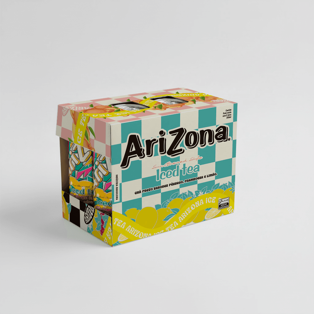
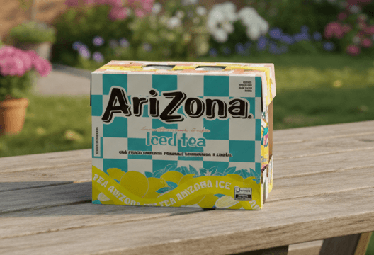
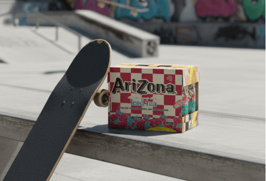
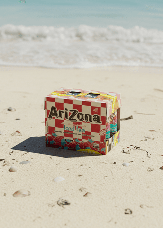
Designing a collectible packaging system that turns variety into a visual experience.
The Arizona Iced Tea 6-pack was conceived as more than a box—it was designed as a showcase of the brand’s creative universe. Each package brings together six distinct flavors, transforming a simple multipack into a curated journey through Arizona’s iconic visual language. Rather than treating packaging as a container, the project treats it as a canvas. Every side of the box becomes an opportunity to express the rich, layered patterns that define Arizona’s identity. From bold florals to geometric rhythms, the structure itself becomes part of the storytelling—inviting customers to explore, rotate, and engage. This is packaging designed to be seen, shared, and kept. The experience doesn’t stop at the product inside—it extends into the physical form, creating a tactile, visual bridge between brand and consumer. It’s not just about holding six cans. It’s about holding six expressions of the same creative DNA. The result is a system that transforms variety into unity, using design to turn diversity of flavors into a single, powerful brand statement.

Challanges
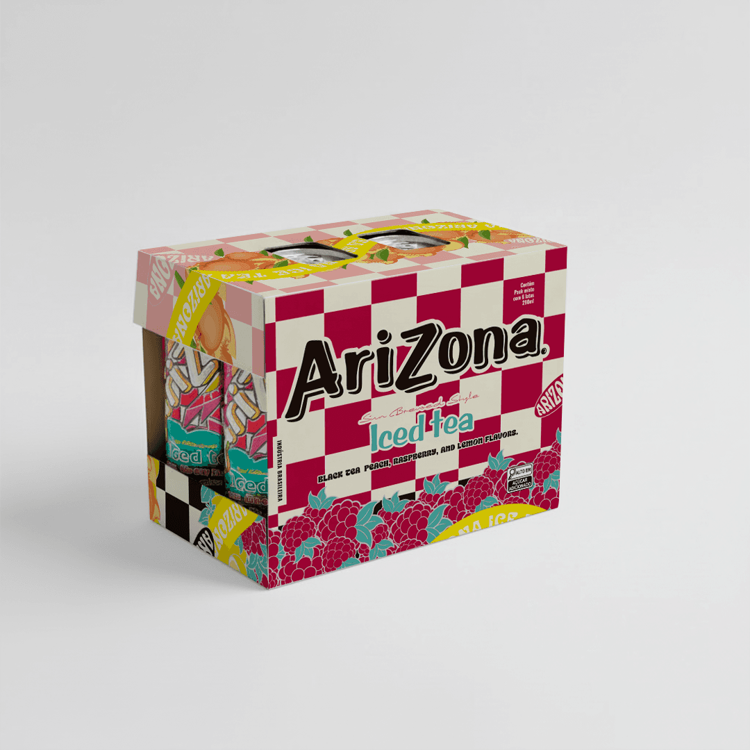
Unifying multiple artistic worlds into one coherent, production-ready structure.
Arizona’s visual identity is famously rich and complex, with multiple patterns, colors, and cultural references coexisting across the brand. The challenge was to bring all of this into a single physical object without creating noise or visual conflict. Each side of the box needed to represent a different pattern while still feeling like part of one cohesive system. This required re-engineering the artwork, carefully rebuilding every element in precise Pantone colors and adapting each pattern to work within the structural constraints of the box. Creativity had to meet absolute technical accuracy. The design couldn’t simply look good on screen—it had to survive print, folding, die-cutting, and real-world handling. Every edge, overlap, and transition needed to be intentional. What looks expressive and organic on the surface is supported by an underlying grid of logic and precision. The final result is a packaging system that feels effortless but is deeply engineered. A box where creativity, color, and structure align—allowing Arizona’s artistic legacy to live not just on the can, but around it.

(03)
PROJECTS