" height="10.34706094700767px" id="QyUiQlqMj" transform="translate(0 1.357)" width="94.64104255022318px"/></svg>)
" height="32.07183057887455px" id="PWcirdVbj" width="27.93742852905099px"/></svg>)
Introduction
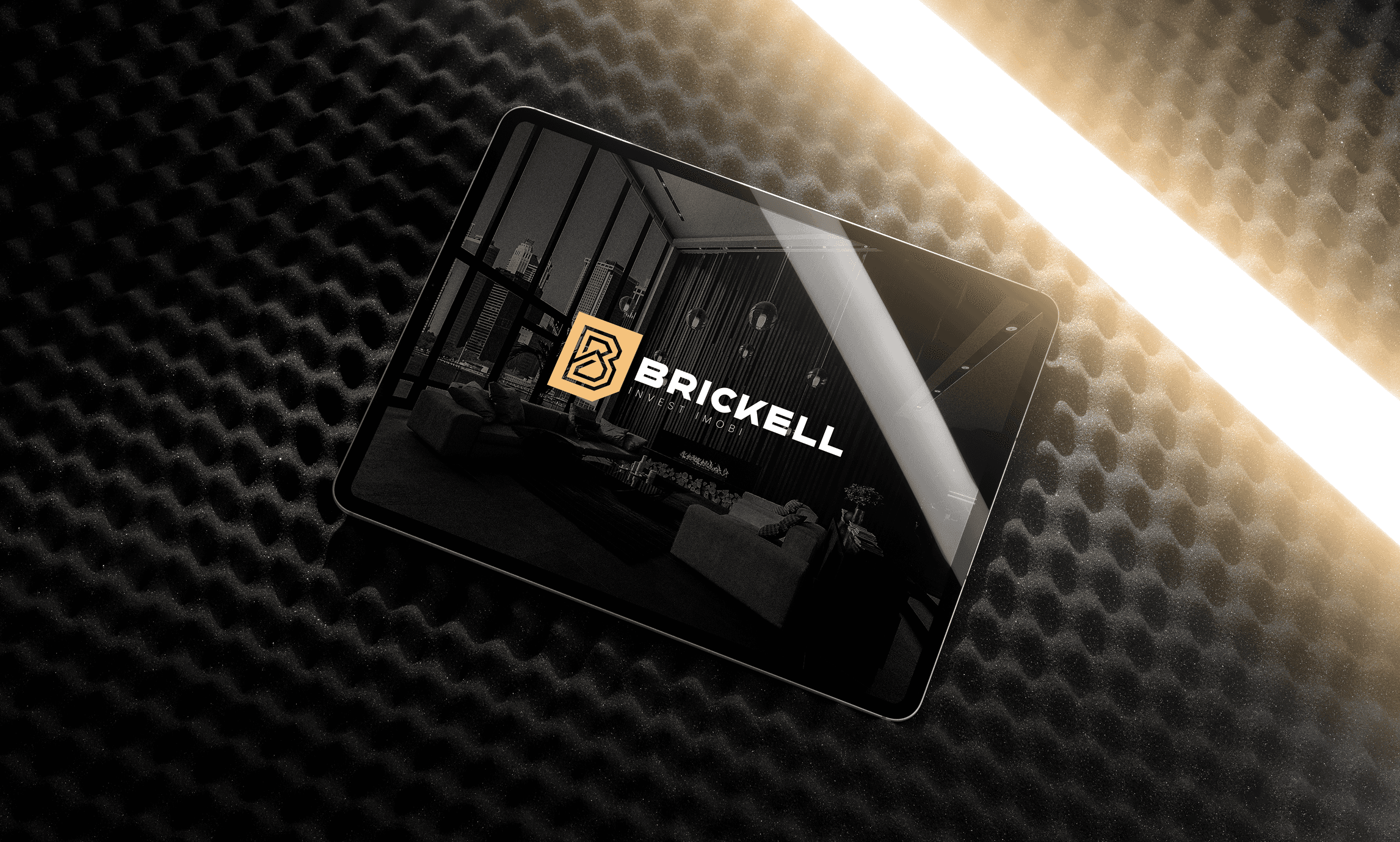
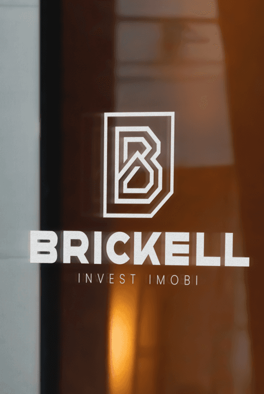
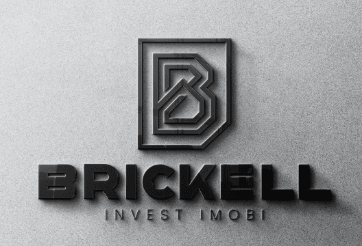
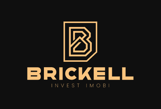
This branding project was developed for a local real estate company focused exclusively on high end properties. The objective was to create a refined and aspirational identity that reflects exclusivity, trust, and contemporary lifestyle.
The brand name was inspired by the Brickell district in Miami, a neighborhood known for its modern skyline, cultural influence, and strong connection to art and architecture. This reference guided the entire visual concept, positioning the brand within a global and sophisticated context while remaining locally grounded.
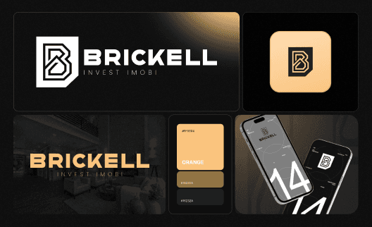
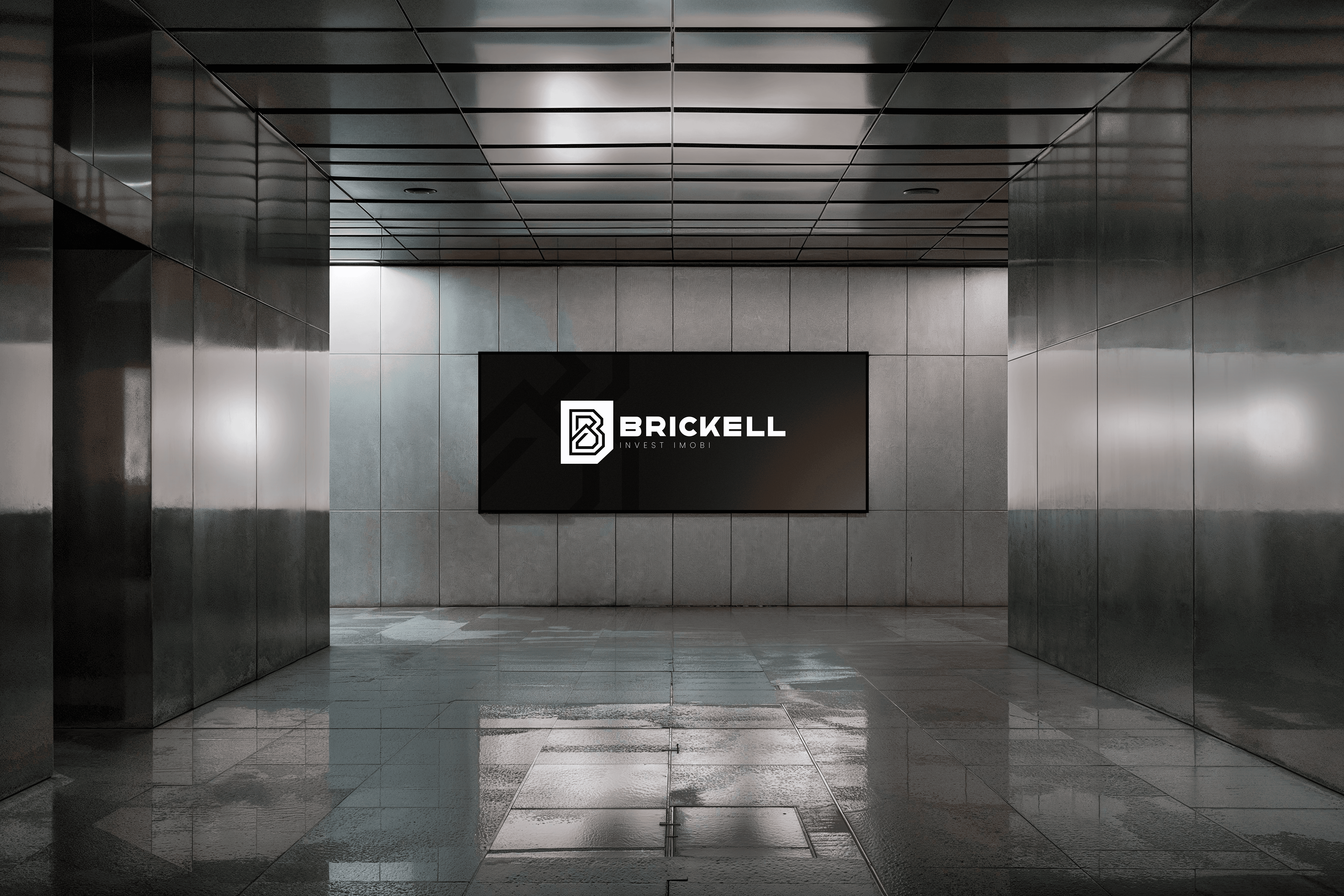
The visual identity was built around the idea of connection and framing. The symbol acts as a visual frame, referencing the large scale artworks and architectural compositions found in Brickell, while also reinforcing structure, stability, and perspective. Modern typography and restrained color choices balance elegance with clarity, creating a system that feels timeless yet current.
This is a brand designed to elevate perception. One that communicates value not through excess, but through intention, precision, and visual confidence.
Challanges
The main challenge was avoiding the common visual clichés associated with social projects.
The brand needed to feel credible, modern, and aspirational, without losing its inclusive and educational core.
Tennis carries strong visual traditions, but translating those references into a fresh identity required restraint and precision. The challenge was to reference the sport without becoming literal, using form, typography, and composition to suggest movement, focus, and progression.
On the digital side, the website needed to communicate clearly with different audiences, including participants, partners, and supporters, while remaining visually cohesive. Accessibility, responsiveness, and clarity were essential, especially for a project designed to reach people from different backgrounds.
The result is a complete system where brand, manual, identity, and website work together seamlessly. A project that feels serious without being rigid and dynamic without being exclusive, using design to amplify impact and make tennis truly accessible.

(03)
PROJECTS